


How Airbnb’s “failed” Prototype Usability Testing became a billion-dollar insight and why beautiful demos hide ugly user truth
The Demo That Fooled Everyone (Including the Founders)
Picture this: A sleek conference room in Silicon Valley, 2008. Three founders present their revolutionary idea to a room full of investors. The prototype is flawless clean interface, smooth interactions, compelling value proposition. Everyone nods approvingly.
The product? An early version of Airbnb.
The reality? Users were completely confused.
Early testers couldn’t understand why they’d stay in a stranger’s home. The booking flow felt unsafe. The value proposition was unclear. What looked brilliant in investor demos was breaking down the moment real users touched it.
Here’s the twist: those “failures” became the foundation of Airbnb’s success.
Instead of polishing the prototype to impress more stakeholders, the founders leaned into the confusion. They watched users struggle, documented every point of friction, and rebuilt their entire approach around what users actually needed: trust, safety, and social proof.
Today, that “broken” prototype insight is worth over $75 billion.
The Prototype Usability Testing Crisis That’s Costing Billions
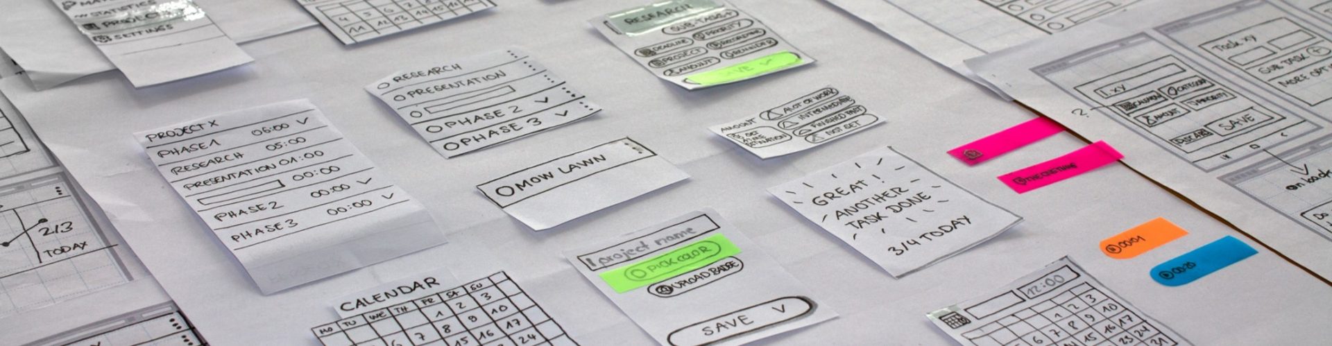
Most teams treat prototypes as internal showcases beautiful artifacts designed to win stakeholder approval and secure development budgets. This is Prototype Theater: the dangerous practice of optimizing prototypes for conference rooms rather than user reality.
But here’s what proper prototype usability testing reveals: According to recent IBM research, fixing a usability problem during development costs 10x more than addressing it during prototyping. Post-launch fixes? 100x more expensive.
Yet 68% of product teams spend more time perfecting prototype presentations than conducting actual prototype usability testing. The result? Expensive development cycles built on beautiful lies.
Prototype Usability Testing: The Science Behind User Confusion
Here’s the uncomfortable truth: prototypes aren’t made to impress stakeholders they’re made to be broken by users.
Every moment of user confusion, every frustrated click, every abandoned task is valuable intelligence. These “failures” reveal the gap between your internal logic and user mental models the most critical insight in prototype usability testing.
The Testing vs. Hoping Distinction in Prototype Usability Testing:
Teams That Hope:
- Run prototype demos with friendly stakeholders
- Focus on what works smoothly
- Avoid scenarios that might reveal problems
- Make design decisions based on internal preferences
- Measure success by stakeholder enthusiasm
Teams That Test:
- Expose prototypes to uninformed users
- Hunt for points of confusion and failure
- Create scenarios designed to break the experience
- Make design decisions based on observed user behavior
- Measure success by task completion and comprehension
The Cognitive Load Crisis: What Really Breaks User Experience
Most prototype failures stem from a fundamental misunderstanding: designers think in systems, users think in moments.
When you’ve spent months designing a product, every feature feels obvious, every flow feels logical, every interaction feels intuitive. But users encounter your interface with zero context, competing priorities, and limited attention.
The Cognitive Load Framework for Prototype Usability Testing:
1. Comprehension Testing: Do Users Understand What They’re Looking At?
The 5-Second Rule: Show users your key screens for 5 seconds, then ask them to explain what they saw. If they can’t articulate the core value proposition or primary action, your visual hierarchy is failing.
Case Study: A Dubai-based logistics startup discovered their “revolutionary” tracking interface looked like a complex dashboard to users. What seemed intuitive to the team (color-coded shipment statuses) was overwhelming noise to busy warehouse managers. The insight? Users needed one number, one status, one action not comprehensive visibility.
2. Navigation Confidence: Can Users Predict What Happens Next?
Users develop mental models within seconds of encountering your interface. If your navigation breaks those models, confusion compounds rapidly.
The Click Prediction Test: Before users click anything, ask them to predict what will happen. The gap between expectation and reality reveals where your interface is fighting user intuition.
Regional Insight: UAE e-commerce teams discovered that Western-style hamburger menus confused users accustomed to more explicit navigation patterns. The prototype “worked” technically but violated cultural interface expectations.
3. Task Flow Reality: Are Users Completing Goals or Getting Lost?
Beautiful individual screens can create terrible user journeys. Prototype testing reveals where logical flows become user obstacles.
The Breadcrumb Test: Ask users to explain how they got to any given screen and how they’d return to previous steps. If they can’t confidently navigate backward, your forward flow is likely flawed.
The Cultural Context Challenge: When Global Prototypes Meet Local Reality
For companies expanding across Saudi Arabia, UAE, Europe, and the US, prototype testing becomes exponentially more complex. Interface patterns that feel intuitive in one culture can feel foreign or even offensive in another.
The Cultural Prototype Testing Framework:
Context Adaptation Research
- Information Hierarchy: How do users from different cultures scan and prioritize interface elements?
- Decision-Making Patterns: Do users prefer individual or collaborative decision-making flows?
- Trust Signals: What visual and functional elements build confidence across different markets?
Case Study: A European fintech company’s prototype tested brilliantly with German users but failed catastrophically in Saudi Arabia. The issue? The individual-focused account setup flow ignored family financial decision-making patterns common in the region. Users literally couldn’t complete tasks their prototype wasn’t designed to support.
Language and Layout Impact
Arabic and Hebrew interfaces require right-to-left layouts, but the implications go deeper than text direction. Mental models for information flow, visual hierarchy, and interaction patterns differ significantly.
Testing Insight: Don’t just translate interfaces test how cultural mental models interact with your core user experience.
The Stress Testing Methodology: Advanced Prototype Usability Testing Techniques
Phase 1: Uninformed User Exposure (Week 1)
- Cold Testing: Show prototypes to users with zero context or training
- Task-Based Scenarios: Give users realistic goals, observe natural behavior
- Think-Aloud Protocol: Capture real-time confusion and decision-making
Key Questions:
- What do users think this product does within 10 seconds?
- Where do they expect to find primary functionality?
- What assumptions are they making about how it works?
Phase 2: Friction Point Analysis (Week 2)
- Micro-Interaction Testing: Focus on individual interface elements
- Error Recovery Testing: What happens when users make mistakes?
- Edge Case Scenarios: Test with incomplete data, poor connections, extreme use cases
Regional Testing Considerations:
- Device Reality: Test on actual devices users have (not premium developer hardware)
- Connection Reality: Test with regional internet speeds and reliability
- Context Reality: Test in actual usage environments (mobile while walking, desktop while multitasking)
Phase 3: Comprehension Validation (Week 3)
- Mental Model Mapping: How do users explain your product to others?
- Value Proposition Clarity: Can users articulate why they’d use this over alternatives?
- Feature Priority Assessment: What do users consider essential vs. nice-to-have?
The Prototype Testing Paradox: Why “Failures” Predict Success
Counter-intuitively, prototypes that generate the most user confusion often lead to the most successful products if teams respond to the feedback correctly.
Why Confusion Is Valuable:
- Assumption Correction: User confusion reveals where your logic differs from user expectations
- Priority Clarification: What you think is important and what users find essential rarely align initially
- Cultural Adaptation: Regional user behavior exposes interface assumptions based on singular market experiences
The Netflix Example: Netflix’s early streaming prototype confused users accustomed to physical DVD selection. Instead of simplifying the interface to match existing mental models, they doubled down on testing why users were confused discovering that recommendation algorithms could replace browsing behavior entirely.
Beyond Testing: Building Prototype Usability Intelligence Into Development
Smart teams don’t treat prototype usability testing as a checkpoint they build continuous user feedback into their development philosophy.
The Continuous Prototype Model:
- Weekly Reality Checks: Regular user exposure prevents assumption drift
- Cross-Cultural Validation: Simultaneous testing across target markets reveals regional adaptation needs
- Competitive Behavior Analysis: How do successful products in your space handle similar user challenges?
The Business Impact: Companies using continuous prototype usability testing report:
- 52% fewer post-launch feature pivots
- 73% higher user satisfaction scores at launch
- 41% faster development cycles (due to reduced assumption-based rework)
Red Flags: When Your Prototype Is Living in Fantasy Land
Warning Signs You Need Real User Testing:
- Your biggest prototype feedback comes from internal stakeholders
- Users consistently take longer than expected to complete basic tasks
- You find yourself explaining how the interface “should” work
- Success metrics focus on technical functionality rather than user behavior
- You’re optimizing for demo smoothness rather than real-world scenarios
The Stakeholder Feedback Trap: Internal feedback creates an echo chamber of shared assumptions. The more stakeholders love your prototype, the more suspicious you should become about real user reception.
The webkeyz Prototype Usability Testing Framework
At webkeyz, we’ve seen brilliant prototypes die in development because teams confused internal logic with user reality. Our prototype usability testing methodology focuses on exposing prototypes to the messiness of real user behavior.
Our Approach:
- Cultural Context Testing: Validating interface assumptions across Saudi, UAE, European, and US user bases
- Cognitive Load Assessment: Measuring mental effort required for task completion
- Behavioral Flow Analysis: Observing actual user navigation patterns vs. intended flows
- Stress Test Scenarios: Exposing prototypes to edge cases and error conditions
Whether you’re refining innovative solutions for Middle Eastern markets or adapting proven concepts for global expansion, prototype usability testing reveals the gap between your design intentions and user reality.
The Uncomfortable Truth About Beautiful Prototypes
The most dangerous prototypes are the ones that work perfectly in controlled demonstrations. They create false confidence, skip crucial learning opportunities, and optimize for the wrong audience.
Real prototype success isn’t measured by stakeholder applause it’s measured by user comprehension, task completion, and behavioral intention.
Every moment of user confusion your prototype reveals is a moment of expensive post-launch confusion you’ve avoided. Every “failure” in testing is a success in learning.
The question isn’t whether your prototype works in demos. The question is: will it survive the first five seconds of real user contact?
Ready to Stress-Test Before Launch?
The next stage in our UX Research Roadmap reveals how to validate user trust and understanding before your product goes live—because launches that look great internally can still fail the crucial first-impression test.
Want to dive deeper into prototype usability testing methodologies? ٍSchedule a consultation to discuss how stress testing can save your next product launch.
Until next time explore webkeyz’s case studies
and Keep Thinking!