


User interface design online is no longer a design concern. It is a growth lever.
In 2025, UI quality directly shapes conversion, retention, support costs, and brand credibility. Digital products no longer compete on features alone—users judge value in seconds, through interface clarity and speed.
When UI works, adoption compounds. When it fails, customers exit silently. This guide reframes user interface design online from an execution layer into an executive discipline—what matters, what breaks at scale, and how leaders make it perform.
Understanding User Interface Design Online: More Than Just Aesthetics
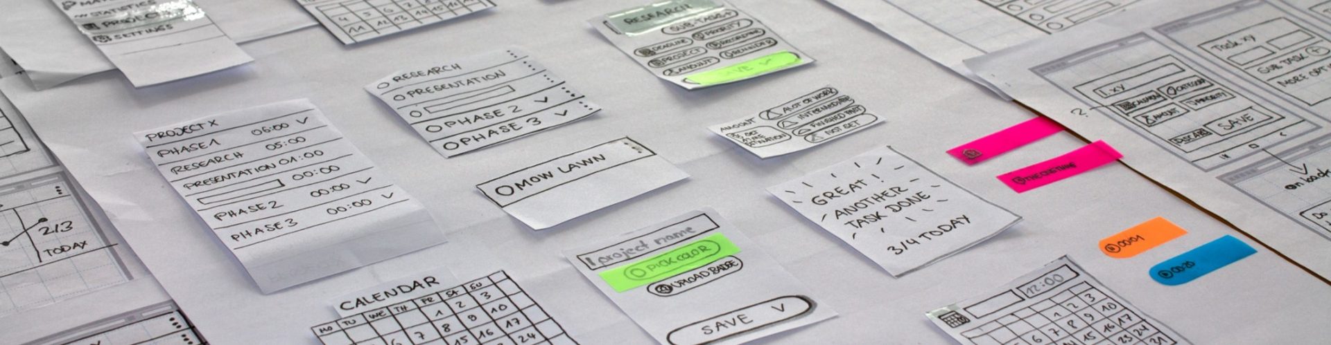
User interface design goes beyond visual appeal. It is a decision system that combines psychology, interaction patterns, and behavioral insight to reduce friction and accelerate user outcomes. When done correctly, user interface design online becomes invisible—users accomplish their goals without friction, confusion, or frustration.
The modern approach to user interface design recognizes that every pixel, every interaction, and every transition serves a purpose. It’s about creating a visual language that communicates functionality while delighting users at every touchpoint. This holistic perspective has transformed how businesses approach digital product development, making user interface design a critical investment rather than an afterthought.
According to McKinsey’s Design Index research, companies that embed design into core decision-making outperform peers on revenue growth and shareholder returns.
The Evolution of UI Design in the Digital Age
The journey of user interface design online has been remarkable. From the early days of skeuomorphic designs that mimicked real-world objects to today’s clean, minimalist interfaces, we’ve witnessed a continuous refinement of how humans interact with technology. Modern user interface design embraces flat design principles, microinteractions, and responsive layouts that adapt seamlessly across devices.
This evolution reflects our growing understanding of human-computer interaction. Modern interfaces prioritize accessibility, inclusivity, and cognitive load reduction. Designers now account for contrast, keyboard navigation, screen reader compatibility, and culturally appropriate visual metaphors, elements often overlooked in earlier iterations.
Core Principles of Effective User Interface Design
Effective user interface design online is enforced through principles, not preference. These principles guide decision-making at scale, ensuring interfaces perform under real user pressure—not ideal conditions.
Consistency: The Foundation of Usability
Consistency in user interface design online creates predictability, which reduces cognitive load and accelerates user learning. When buttons, colors, typography, and interaction patterns remain consistent throughout an interface, users can focus on their tasks rather than relearning the interface with each new screen. This principle extends beyond individual products—leveraging familiar patterns from widely-used platforms helps users feel immediately comfortable with your interface.
Successful user interface design online implements consistency at multiple levels: visual consistency ensures that similar elements look similar, functional consistency means similar actions produce similar results, and external consistency aligns with broader design conventions users already know. This layered approach to consistency builds trust and competence, two crucial factors in user satisfaction.
Hierarchy: Guiding User Attention
Visual hierarchy in user interface design online determines what users notice first, second, and third. Through strategic use of size, color, contrast, and positioning, designers create pathways that guide users through content and actions in a logical sequence. Effective hierarchy makes interfaces scannable, allowing users to quickly identify important information and available actions without reading every word.
The best user interface design online employs multiple hierarchy techniques simultaneously. Typographic hierarchy uses size and weight variations to distinguish headings from body text. Spatial hierarchy leverages whitespace to create groupings and relationships. Color hierarchy draws attention to primary actions while de-emphasizing secondary options. When these techniques work in harmony, the interface feels effortless to navigate.
Feedback: Confirming User Actions
Immediate, clear feedback represents a non-negotiable element of quality user interface design online. Every user action should generate a response that confirms the system received the input and is processing it. This feedback might be visual (a button changing state when clicked), auditory (a notification sound), or haptic (a phone vibrating when an action completes).
Without adequate feedback, users feel uncertain about whether their actions succeeded, often leading to repeated clicks, frustration, and abandonment. Modern user interface design implements feedback at multiple stages: on hover (showing interactivity), on click (acknowledging input), during processing (loading indicators), and on completion (success or error messages). This comprehensive feedback system creates confidence and reduces anxiety during user interactions.
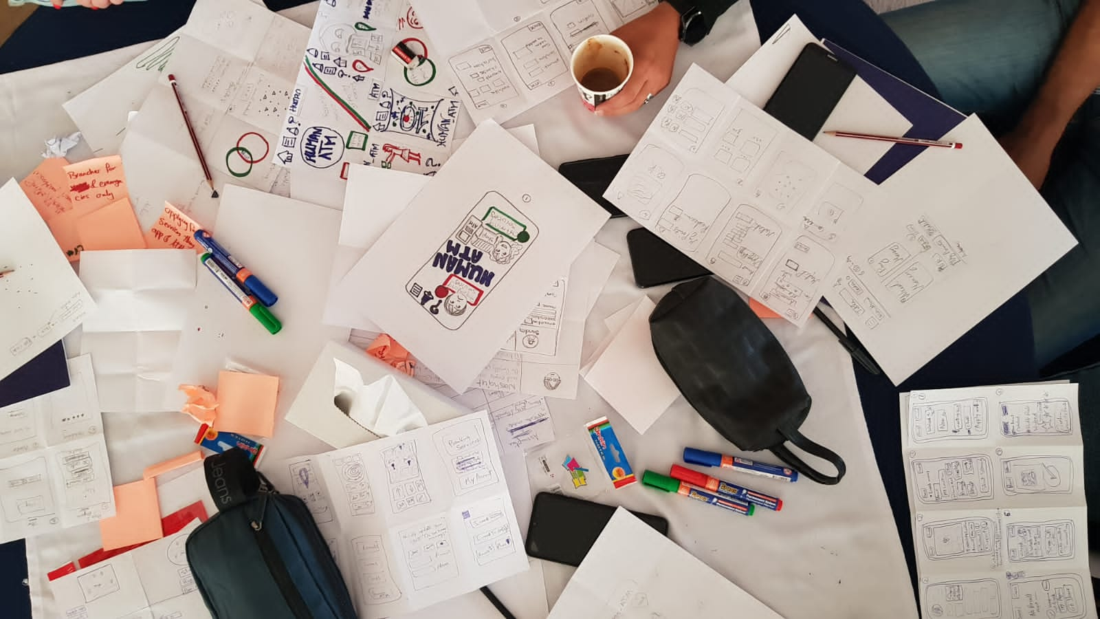
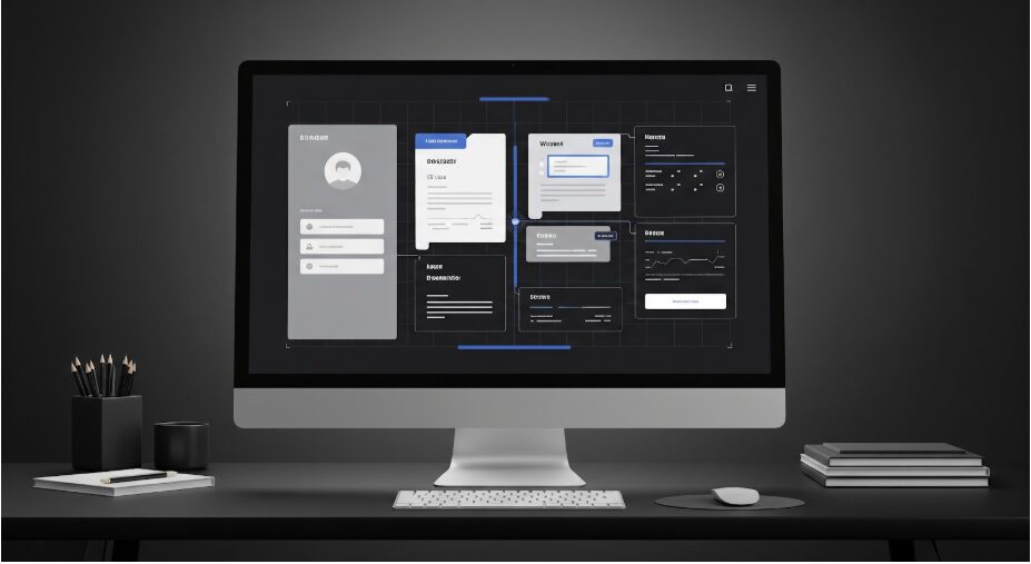
Essential Tools for User Interface Design
The user interface design online ecosystem offers an extensive toolkit that empowers designers to work efficiently, collaborate effectively, and produce professional-quality results. Choosing the right tools significantly impacts workflow, iteration speed, and final output quality.
Design and Prototyping Platforms
Professional user interface design online relies on sophisticated design tools that enable pixel-perfect layouts, component-based design systems, and interactive prototypes. Figma has emerged as a dominant platform, offering collaborative design in real-time through browser-based access. Its component libraries, auto-layout features, and developer handoff capabilities make it ideal for team-based user interface design online projects.
Adobe XD provides another robust option for user interface design online, particularly for designers already embedded in the Adobe ecosystem. Sketch remains popular among Mac users, while newer entrants like Framer bridge the gap between design and development with code-based components. The choice depends on team requirements, collaboration needs, and integration with existing workflows.
Design Systems and Component Libraries
Mature user interface design online practices leverage design systems—comprehensive collections of reusable components, patterns, and guidelines that ensure consistency across products. Tools like Storybook allow teams to build and document component libraries, creating a single source of truth for user interface design online elements.
Design systems accelerate user interface design online by eliminating repetitive work and ensuring brand consistency. They enable scalability, allowing teams to maintain quality as products grow in complexity. Popular design systems like Material Design, Ant Design, and Carbon provide battle-tested patterns that teams can customize for their specific user interface design online needs.
User Testing and Feedback Tools
Exceptional user interface design online emerges from continuous testing and refinement. Tools like UserTesting, Maze, and Lookback enable designers to observe real users interacting with prototypes, uncovering usability issues before development begins. Hotjar and FullStory provide session recordings and heatmaps that reveal how users navigate live interfaces.
These insights transform user interface design online from subjective opinions into data-driven decisions. Analytics tools like Mixpanel and Amplitude track user behavior patterns, informing design iterations that improve engagement and conversion. The combination of qualitative user testing and quantitative analytics creates a comprehensive understanding of interface effectiveness.
Best Practices for Modern User Interface Design Online
Contemporary user interface design online demands adherence to proven practices that balance aesthetic appeal with functional excellence. These practices reflect years of collective learning from successful products and user research across industries.
Mobile-First Thinking
With mobile devices generating the majority of web traffic, user interface design online must prioritize mobile experiences. Mobile-first design forces designers to identify core functionality and present it clearly within constrained screen space. This constraint often results in cleaner, more focused interfaces that scale up effectively to larger screens.
User interface design online for mobile requires careful consideration of touch targets, thumb reach zones, and gestural interactions. Buttons must be large enough to tap accurately, critical actions should fall within comfortable thumb reach, and swipe gestures should feel natural. Successful mobile user interface design online respects the context of mobile usage—users often have limited attention, poor connectivity, and single-handed operation.
Accessibility as Standard Practice
Inclusive user interface design online ensures products serve all users, regardless of abilities. This means designing for users with visual impairments (providing sufficient contrast and screen reader support), motor impairments (enabling keyboard navigation and generous click targets), cognitive differences (using clear language and predictable patterns), and hearing impairments (providing captions and visual alternatives to audio).
Accessibility in user interface design online isn’t just ethical—it’s also good business. Accessible interfaces serve a broader audience, improve SEO, reduce legal risks, and often benefit all users through clarity and simplicity. WCAG guidelines provide concrete standards for accessible user interface design online, covering perceivable, operable, understandable, and robust interfaces.
Performance Optimization
Even the most beautiful user interface design online fails if it loads slowly or responds sluggishly. Performance optimization must be integral to the design process, not an afterthought. This means optimizing images, minimizing animations that cause layout shifts, implementing lazy loading for below-the-fold content, and prioritizing above-the-fold rendering.
User interface design online should account for varying network conditions and device capabilities. Progressive enhancement ensures core functionality works even on slower connections, while performance budgets keep file sizes manageable. Every animation, image, and interaction should justify its performance cost against the value it provides to users.
Color Theory in User Interface Design Online
Color wields tremendous power in user interface design online, influencing emotions, guiding attention, and communicating brand identity. Strategic color application transforms functional interfaces into memorable experiences while maintaining usability and accessibility.
Establishing a Color Palette
Effective user interface design online begins with a carefully constructed color palette that balances brand expression with functional requirements. Primary colors establish brand identity and highlight key actions. Secondary colors provide variety and support different interface states. Neutral colors create hierarchy and provide breathing room. Success, warning, and error colors communicate system status universally.
When building palettes for user interface design online, designers must consider accessibility requirements, ensuring sufficient contrast between text and backgrounds. Tools like Coolors and Adobe Color help generate harmonious palettes, while contrast checkers verify WCAG compliance. A well-designed palette provides enough variety for complex interfaces while maintaining visual coherence.
Color Psychology and User Behavior
Colors trigger psychological responses that influence user perception and behavior in user interface design online. Blue conveys trust and professionalism, making it popular for financial and corporate applications. Green suggests growth and positivity, common in health and environmental contexts. Red grabs attention and signals urgency, ideal for error states and sale promotions. Understanding these associations helps designers make intentional color choices in user interface design online.
However, color meanings vary across cultures, requiring cultural awareness in global user interface design online projects. What signifies prosperity in one culture might indicate danger in another. Successful international user interface design online either uses universal color conventions or adapts palettes for different markets, ensuring colors support rather than undermine the intended message.
Typography: The Voice of User Interface Design Online
Typography shapes the personality and readability of user interface design online. Font choices, sizing, spacing, and hierarchy decisions directly impact how users perceive and process information, making typography fundamental to effective interface design.
Selecting Appropriate Typefaces
User interface design online typically employs two typeface categories: sans-serif fonts for their clean, modern appearance and excellent screen readability, and serif fonts for specific contexts requiring traditional authority. Modern user interface design online often combines typefaces strategically—a distinctive display font for headings paired with a highly readable font for body text.
When selecting fonts for user interface design online, designers evaluate legibility across sizes, character distinction (avoiding confusion between similar letters), language support, and loading performance. System fonts offer optimal performance and familiarity, while custom fonts provide brand differentiation. Variable fonts represent an exciting evolution, offering multiple weights and styles in a single file, reducing load times in user interface design online.
Creating Typographic Hierarchy
Typography establishes information hierarchy in user interface design online through systematic variations in size, weight, and spacing. A well-executed typographic scale creates clear distinction between heading levels, body text, captions, and labels. This hierarchy enables users to scan content efficiently, understanding structure and importance at a glance.
Effective user interface design online implements consistent typographic spacing—line height (leading), letter spacing (tracking), and paragraph spacing. Adequate spacing improves readability and creates visual breathing room. Modular scales generate harmonious size relationships, creating typographic systems that feel mathematically balanced yet visually pleasing.
Layout and Composition in User Interface Design Online
Layout orchestrates how elements arrange themselves within user interface design online, creating visual flow, establishing relationships, and guiding user journeys through digital spaces. Masterful layout transforms disparate elements into cohesive, navigable experiences.
Until next time explore webkeyz’s case studies
and Keep Thinking!