When a user navigates to a website, they usually start looking around, and if you’ve really piqued their interest they might even scroll right down to the bottom of your homepage. To many, this is usually a dead end. The user either leaves the website or scrolls back up to navigate to another page if you’ve caught their attention with something along the way. But what if your footer could be the beginning of a completely new journey for your users? If you use these website footer design best practices, it can be!
Website footer design has gone through various phases over the course of its lifetime: from one-liners, to simple sitemap footers, to fat footers containing lots of information and interactive elements. Each of these phases arose to solve a certain problem, but which of these is ultimately the best for your business?
Ask any web designer and they’ll tell you that adding a footer to the design comes as second nature. No one really questions whether a footer is needed or how to optimize it for best results. Although footers seem to be a given, they’re probably the most neglected section when it comes to website design, which is a great waste when you find out that well-designed footers have the potential to increase sales conversions and revenues!
Establishing Uses for Your Footer
Do you even need a footer? If the answer is “Yes of course!”, then you need to think about the reasons behind your answer. Does your website have a complex navigation structure that requires a footer to highlight important links? Do you need to highlight specific sections on your website? Do you want to add a powerful call to action to boost conversions? Or do you perhaps want to highlight your social media accounts and contact details? You always need to think about why you need the footer to be able to identify what are the best footer designs for your specific case.
Keep in mind that some website designs automatically exclude footers, like Facebook and Quora for example which feature endless scrolling.
Website Footer Design Components
A successful footer allows users to accomplish a task or objective (finding information or subscribing for example). Any business must understand its users and their behaviors in order to be able to decide the most optimal use for their website footer.
Footers come in all shapes and sizes and can include all sorts of components, among which are:
- Sitemap
Sitemaps are an important part of any website, impacting its Search Engine Optimization. They are mainly used by search engines for indexing purposes.
- Navigation Links
This could be one of the most important components in your footer. If a user has scrolled this far down, chances are they didn’t find what they were looking for, so here’s your chance to provide it. One of the best website footer design practices is having links to other relevant pages on your website that your visitors might find useful. The types of links you add here can be based on your user behavior flow or perhaps most-searched queries, or alternatively internal pages that need a ranking boost.
- Calls-to-Action
Placing a CTA in the footer could be a perfect conclusion for your webpage because it gives visitors a specific direction and contributes to the continuity of the experience.
- Contact Form
You can add a link to your main contact page here, since visitors expect your contact information to be linked to in the footer (as well as the top right corner of the header).
- About/Keywords for SEO
The SEO value of keywords in footers is debatable. However, you can use the opportunity for one more quick description of who you are, including your main keywords.
- Copyright
Your go-to protection against plagiarism, albeit a weak one. It doesn’t really guarantee anything but if your footer displayed only one thing, this would probably be it.
- Contacts & Map
This tells google about your location and gives visitors easy access to reaching or contacting you. This is especially useful if users are inclined to visit or call after viewing your website, think restaurants or retail shops.
- Social Icons
The footer is considered an optimal place for linking to social media pages because it’s a natural continuation of the experience. It also ensures that if a user clicks and gets drawn into the social media vortex, at least it happens after they’ve gone through your entire page first!
- Newsletter Subscription
This might not be the best place to place a signup box, but it is done. Just make sure it’s a well-thought-out design that helps conversion, rather than a lone box added as an afterthought.
- Privacy Policy and Terms of Use
The privacy policy basically describes the type of information the website gathers, how it stores this gathered data, and then how it uses it. The terms of use on the other hand is a disclaimer that describes what the visitor agrees to by visiting the website. You might want to include the actual terms of use themselves in the footer if the activity taking place on the website is of a legally critical nature.
- Search
Another option that can be used if you really must, but it’s not advisable. Search boxes are usually expected to be above the fold.
- Certifications and Awards
This is a good sign of authority and credibility that could increase visitor trust and encourage them to navigate to another page to further explore your offerings.
We’ve shared here 12 website footer design components, but you might find footer ideas being largely dynamic. You could find us changing them in the not so distant future, so visit often!
How to Achieve the Best Website Footer Design
Usability is all about indulging human behavior. And while the below recommendations will generally bring you closer to the best website footer design practices, the best way to be certain that what you’re designing is aligned with you users’ needs is to conduct user research, whose value is indispensable to your organization. Keep that in mind while you take the following points into consideration as you strive for the best website footer design.
Aim for Simplicity


“Make it simple, but significant.”
Don Draper
People are bad at processing a lot of information and if your footer design is complex people will get distracted.
Simplicity is one of the most important principles in design and usability. It’s about removing unnecessary elements from your design, allowing users to get your point easily.
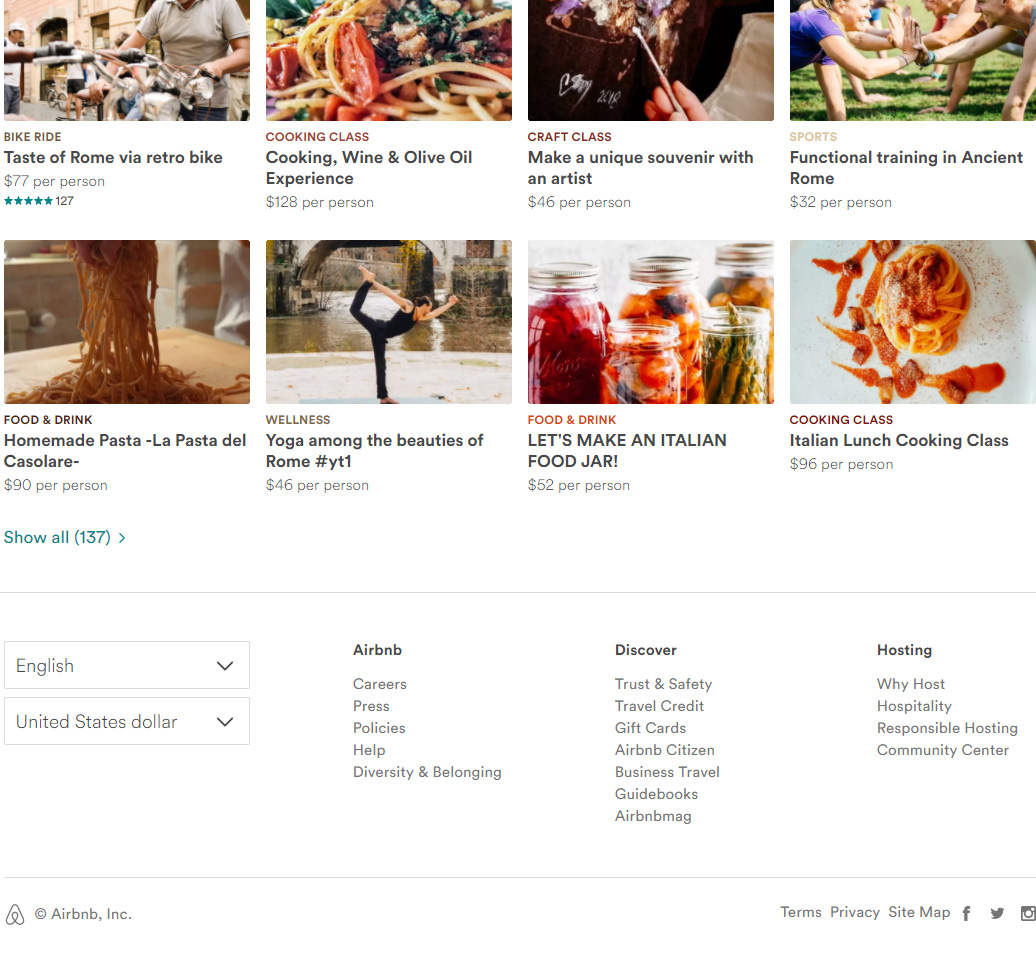
Airbnb’s website illustrates the principle of simplicity nicely:
- They use a single font in two shades of grey
- Links are categorized in a highly scannable, 3-section format
- Two clear dropdowns are available for changing settings
- Three simple social media icons
Everything is clear and in its expected place with simple typography, neat organization, and neutral grey shades that are easy on the eyes.
Be Bold… Use Contrast
Contrast helps an object stand out by making it visually distinctive from other objects in the background.
Since the footer is the last thing that appears on your website, it will be disregarded if it is visually unappealing or if it blends in too much into the background. Making good use of the contrast principle will greatly help you with attracting a user’s attention and directing their eyes to important information or CTAs.
Contrast is not confined to colors, it can be achieved using other style elements like sizes, shapes, and typography styles.
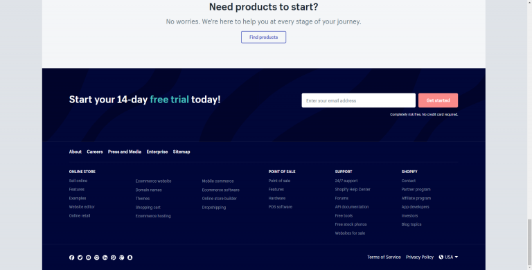
Shopify cleverly uses contrast in its website footer design:
- The dark blue color commands your attention
- The red CTA button contrasts nicely with the blue background, thereby drawing attention
- The hierarchy of font sizes and boldness to differentiate between main five navigational elements
Use White Space Effectively
Think of Google’s web page design. It’s almost all white space free from distractions; just the logo, a search field, and search button.
White space improves text readability, creates balance in your design, simplifies your design, and helps you highlight important information.
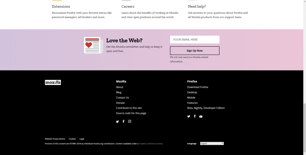
Mozilla’s website footer efficiently makes use of white space which helps users quickly identify different categories, making the design very simple and easily scannable.
Organize Information Well
In design, the close proximity of elements suggests a relationship between them.
When designing the footer, this becomes a very important design concept since in many cases it is a collection of links, icons and categories which need to be visually separated and categorized.
Grouping related elements make it easy for your users to visually recognize the categorization and helps guide them to the information they’re looking for.
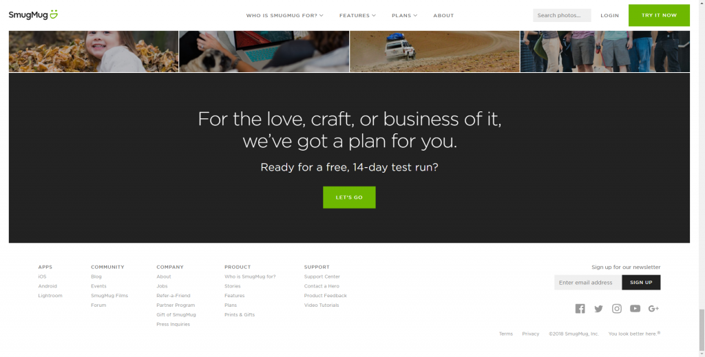
Smugmug organizes their footer links and elements using the concept of proximity. You can see that they have 5 main categories with relevant links underneath each. They also use space to separate these categories from the newsletter subscription and social media icons.
You’ve Reached this Article’s Footer!
Ultimately, the best website footer design is what works for your business and drives results of your website. However you choose to design your footer, always keep these 3 points in mind:
- Make it relevant to the information you’re displaying
- Make it visually appealing, allowing attention to be drawn to critical information
- Make it simple in order to avoid an overwhelming experience
What’s your take on the best website footer design? Have examples of websites with super cool footers? Share them with us on socials!
And scroll down a little further to see how we’ve handled our footer…

